

Each fruit has its own packaging within an adaptable design system, completed with a personalized sheet that explains its origin and characteristics.
The project uses contrasting colors and a simple graphic language to reinforce the sense of humor and surprise.
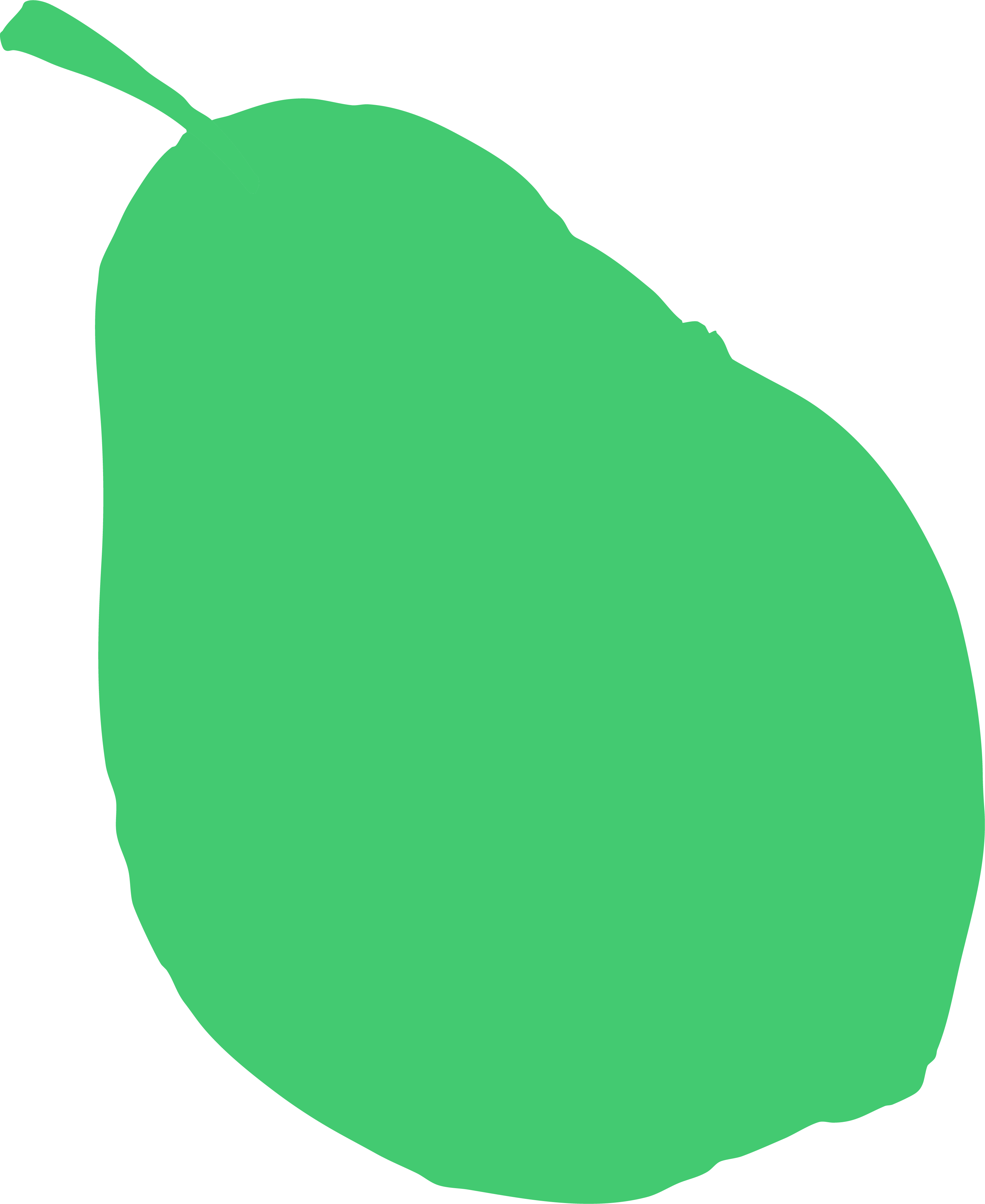
The silhouettes of the fruits, placed on the top, side and bottom, play with perception and position, making each side of the box offer a different reading with a touch of irony. The typography, with a geometric and contemporary stroke, brings order and clarity, contrasting with the organic shapes of the fruits and thus generating a coherent and attractive visual balance.
/In the box

/CATEGORY
Packaging & Ilustration
2025
/IDEA
This packaging plays with the contrast between nature and design. By enclosing a fruit—round, organic and alive—in a rigid, square box, a visual and symbolic tension is generated. This formal choice incorporates a gesture of humor and irony: a critical and at the same time playful look at how design and marketing often end up prioritizing form over essence.


